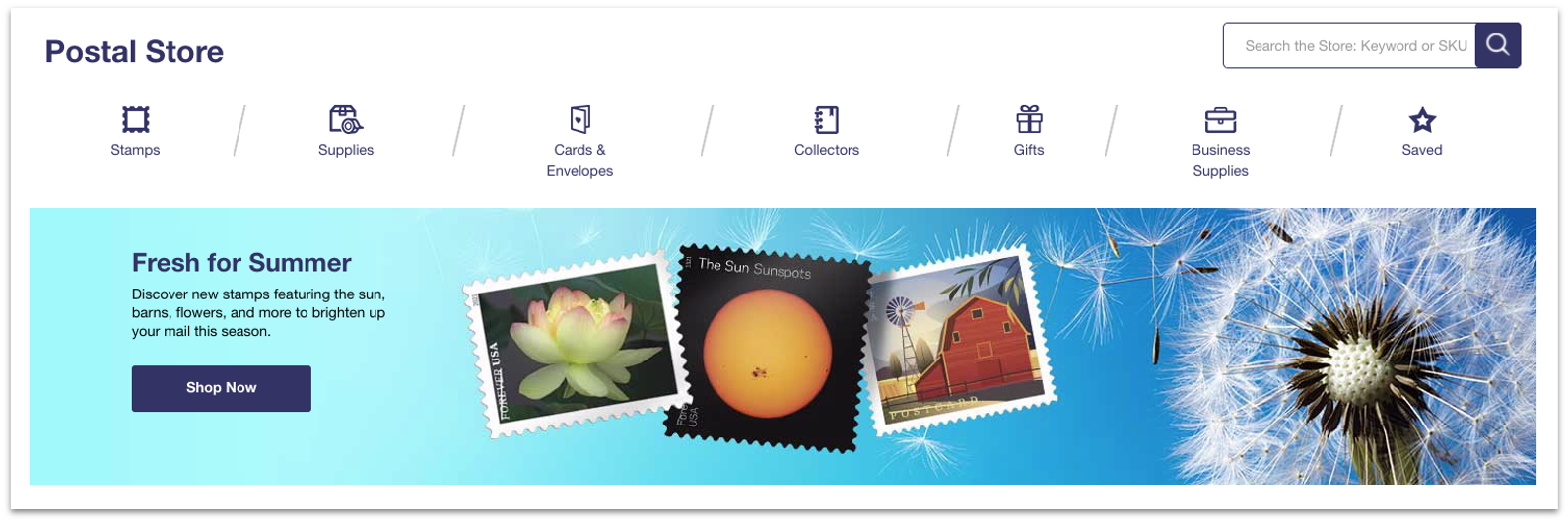
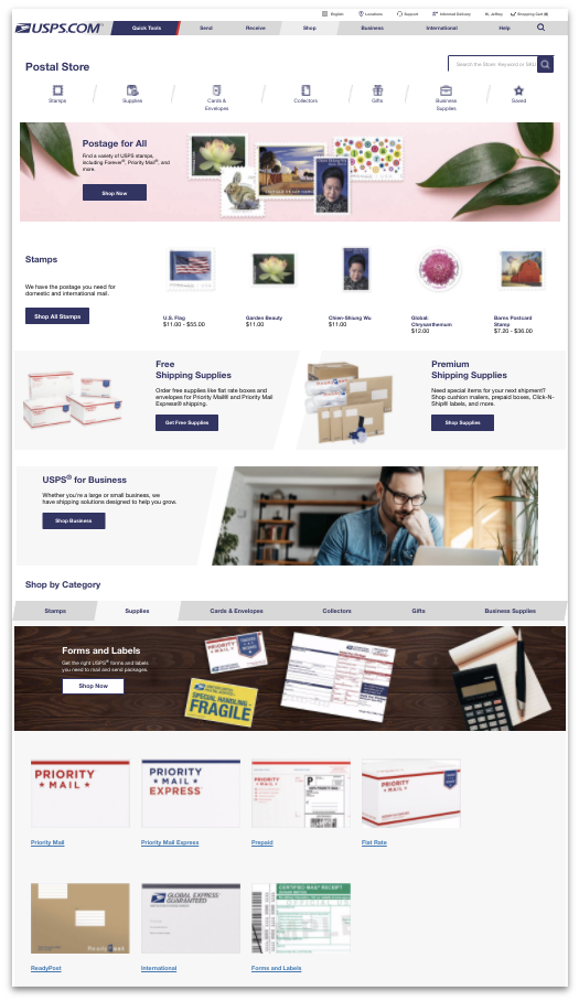
The Postal Store gives USPS® customers the convenience of ordering online
Customers can order stamps, shipping supplies, and unique items only available from the United States Postal Service®
The Postal Store gives USPS® customers the convenience of ordering online
Customers can order stamps, shipping supplies, and unique items only available from the United States Postal Service®
 ©USPS
©USPS
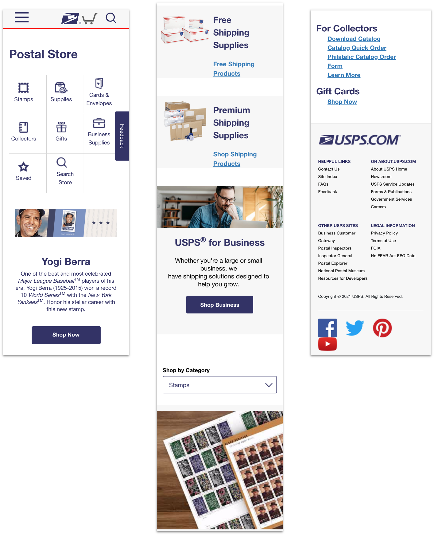
Enables customers to Shop by Category on the page.
Customers can either use their account or use Guest Checkout.
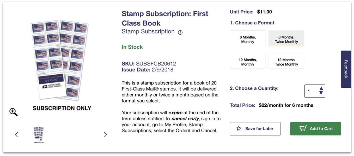
Customers can subscribe for Stamps.
Free shipping supplies for customers.
 ©USPS
©USPS
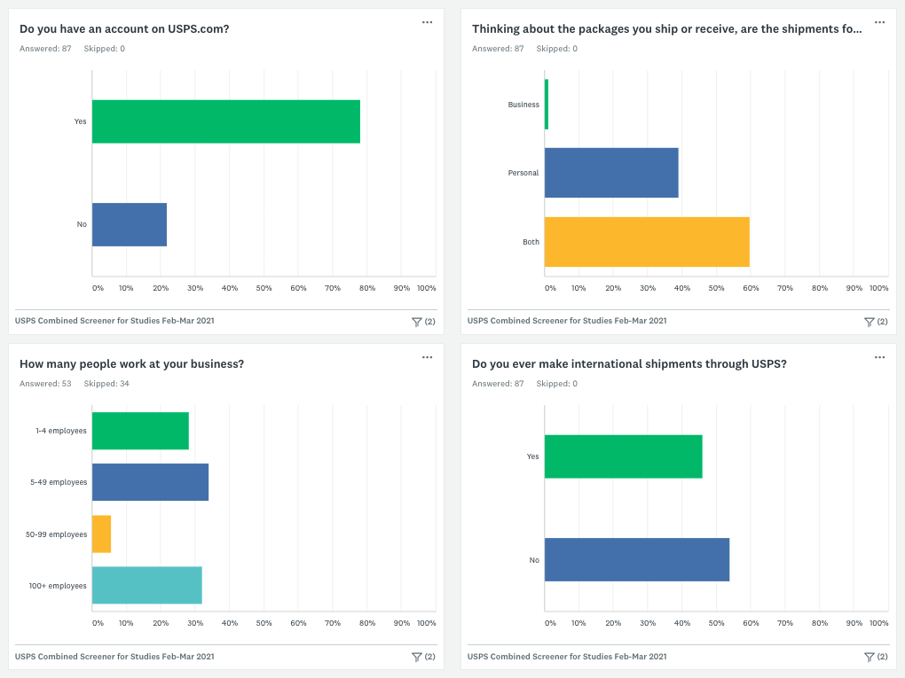
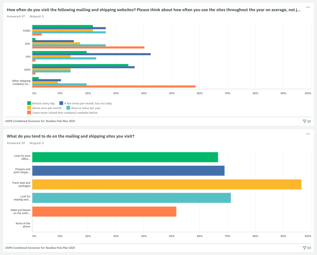
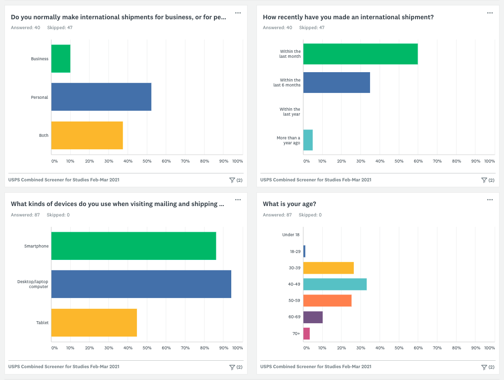
During the Discovery phase, major user groups were identified as Consumers and Business users
A focus on those without a USPS.com® account
28 usability test sessions were conducted remotely with Consumers and Business users across the US

Customers gave an average rating of 5.7 (out of a possible 7)
Nothing on the USPS.com® homepage specifically mentions “Store”
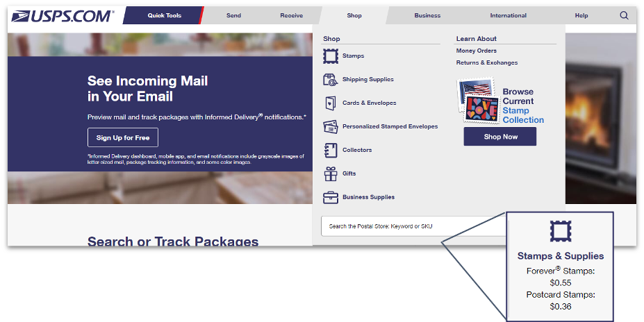
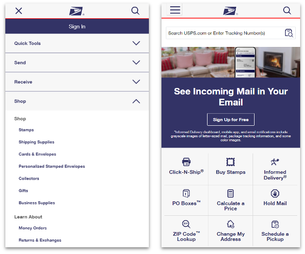
Customers liked the content and general appearance
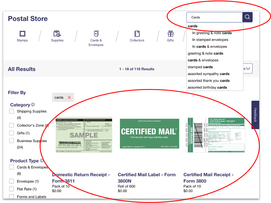
Searching for cards in the Store returned non-card items
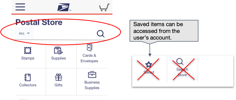
Add a category dropdown as shown below which has All, stamps, supplies, gifts, etc. as options
Search field suggests “in Stamps”, or “in Supplies”, etc. below each autosuggest option

Consider reducing the number of icons to raise the fold and avoid the blank space
Saved could be moved to the Account pop-up, and Search could have a different design
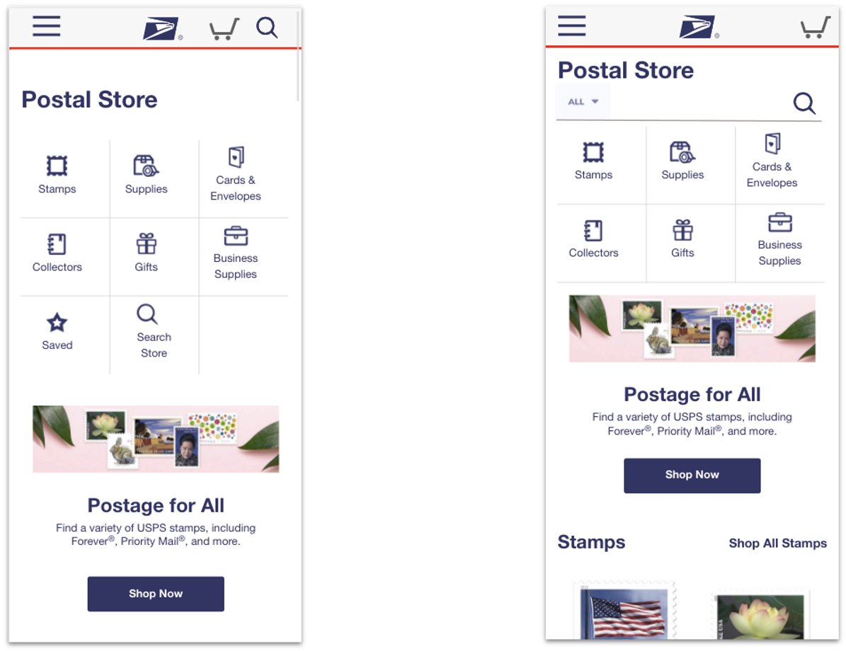
Customers wondered why these spaces were blank
Customers missed pagination below the fold as they assumed that the items ended
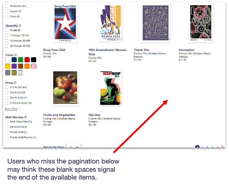
Consider dynamically filling the last 2 spaces depending on the number of items on the list.
Note that this will also affect the Per Page dropdown number.
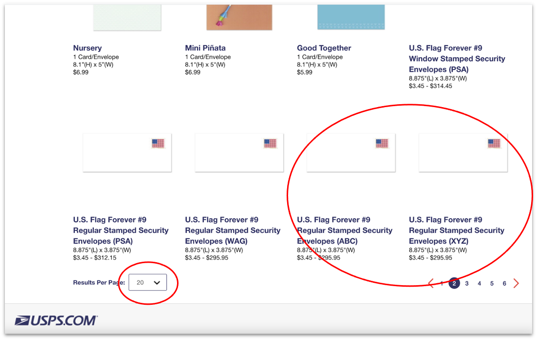
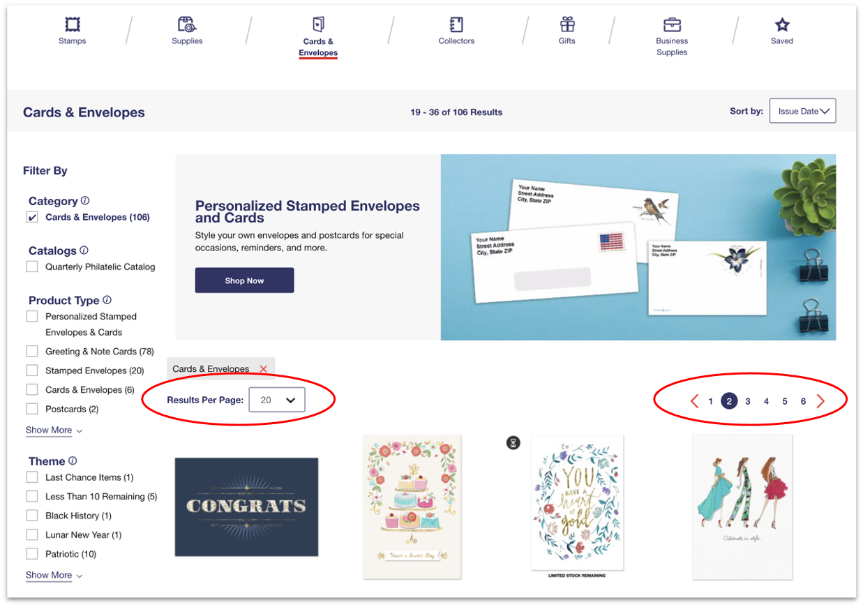
Having pagination at both the top and the bottom would be beneficial
Per Page control is rather far from the pagination and could be overlooked

Consider including the pagination and Results Per Page controls at both top and bottom of the page
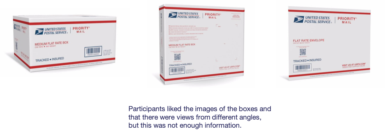
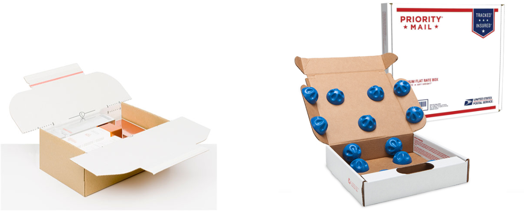
Consider diagrammatic and / or object images for determining box size
“Boxes 1-5” option was confusing - pack of 5, or the boxes were part of a set
Not all read the highlighted text which mentions “single (1-5),”
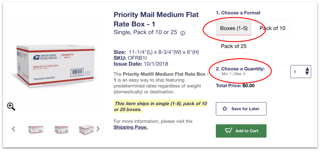
Consider changing the wording to "Single Box"
Highlight the quantity input box in red with the error right below it - inline error.

Some customers did not take “$0.00” to mean “free"
They felt that price would update once the item was added to their cart along with shipping
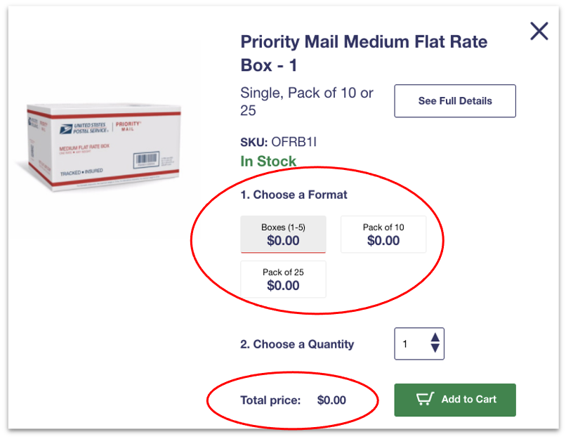
Consider whether showing “Free” wording for free supplies would be beneficial

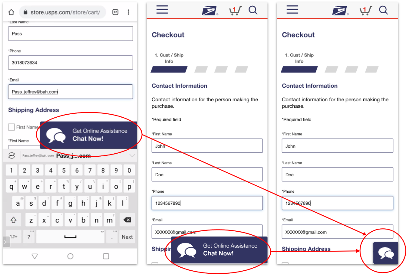
The Chat Now option was very large on Mobile screens
It reduced the visible screen space and obscured fields lower in the form
Reduce the size of the Chat Now prompt on Mobile
Show the chat option with text for a couple of seconds and minimizing it to just an icon
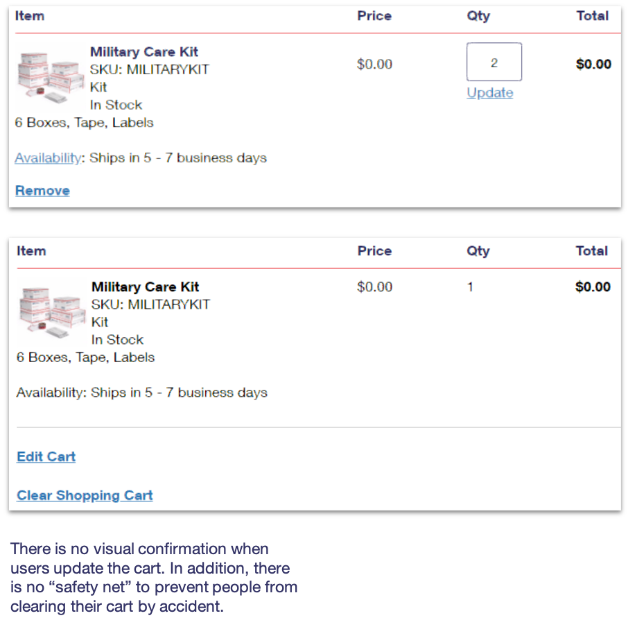
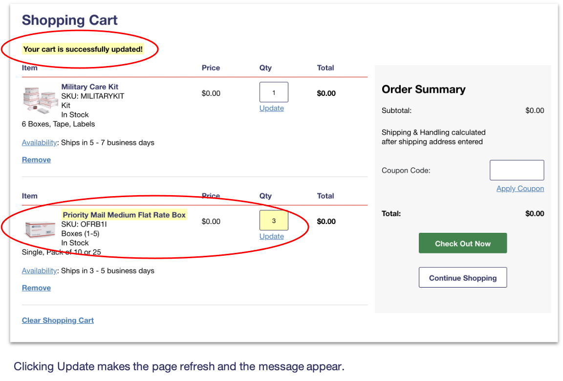
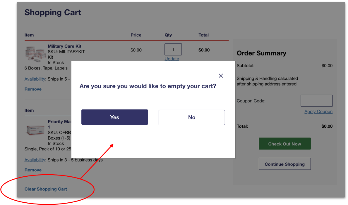
When a customer updates the quantity, there is no visual indicator of a successful update
Customers tended to look first on the USPS.com® homepage, then in Stamps, and then in Business Supplies
Part of filter options: Those that looked in Stamps missed the filter for Stamp Subscriptions
Average rating of 2.7 (out of a possible 7) in terms of how easy it was to locate Stamp Subscriptions

Stamp subscriptions should be mentioned or linked to in other parts of the site, such as the "Shop" megamenu
Stamp subscriptions could be shown as an additional list item or advertisement
Odd that the prices shown are all the same
The total does not update based on the option selected
Average rating of 3.4 (out of a possible 7) in terms of how easy it was to understand the formats and costs

Potential changes to the cost display according to subscriptions
